


I am back from my brief but relaxing vacation down the shore. I traded homework for yard work, pie chart making for pizza making, and data processing for some golfing. This is a friendly reminder to use your PTO. It’s important to take time to recharge and I actually come back better at my job after a few days off.
I also came back with some great ideas for the next few write-ups. I think my upcoming content will make up for the week-long hiatus.
This week I wanted to look at drive results per NFL team from last season. Specifically, what’s the end result of each team’s offensive drive depending on where that drive starts? I’ve been on a circular kick lately so I thought a chord diagram using R could be a refreshing interpretation of this data.
For my paid subscribers, I’ll drop a tutorial on how to make these diagrams using nflfastR data later this week. As always I found the R Graph Gallery to be a priceless resource for this viz. I’ve felt a shift in my work lately from Python-based programming to R-based. I’m still all Python and SQL at work but I’m currently in a grad school class that’s entirely R-based. I’ve found myself gravitating more towards R in my personal projects as I’ve learned more about it. I’ve found ggplot, repr, and ggalign to be much more user-friendly than matplotlib, and I can still use duckdb and plotly through R when necessary. It’s just personal preference at this point.
Before we get into the chord diagram (which eventually turned into a circular bar chart), here’s some content I personally enjoyed this week.
Analytics (and some other) content I enjoyed over the past two weeks.
I got about halfway through Barbarian Days by William Finnegan while down the shore. Thought I should share some vacation content in this portion for this week. It’s a great autobiography and ode to surfing. Perfect beach read.
The folks over at datagolf are always updating their awesome website. They’ve done a great job visualizing how insane of a run Scottie Scheffler is on right now. Check it out here.
I enjoyed this article from Mike Tanier last week about the Tampa Bay Buccaneers punting situation. Check it out here.
I loved this graph from Thomas Nestico showing how Max Muncy has improved as a hitter since he started wearing glasses. Check it out here. It’s exactly like the movie Major League.
Evan Lawing has been posting great hockey visualizations all season, here’s a table showing the last few Selke Trophy winners in the NHL. Check it out here. Anyone catch that Oilers win last night in overtime?
2024 NFL Season Drive Summaries
This week I wanted to do something with the fixed_drive_result column in the nflfastR data. Specifically, what percentage of NFL team offensive drives lead to specific results? How many result in touchdowns? Turnovers? Field goals? Are there any trends among good teams, bad teams, playoff teams? Let’s take a look for ourselves:
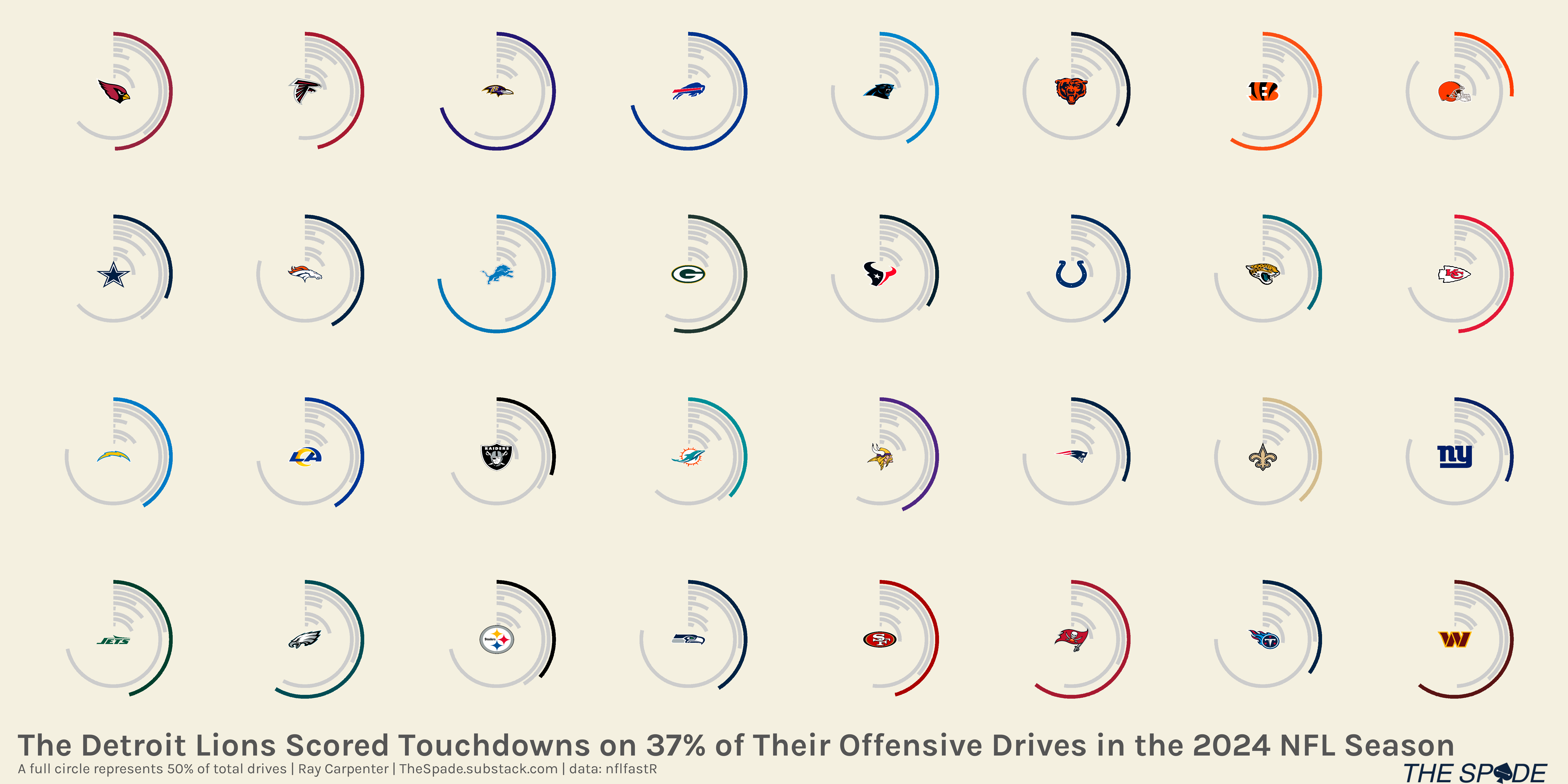
The Detroit Lions led the league in percentage of total offensive drives that ended in touchdowns last season. The Buffalo Bills and Baltimore Ravens are second and third with touchdowns on 35.64% and 35.29% of their offensive drives from last season, respectively. The Super Bowl Champion Philadelphia Eagles scored touchdowns on 29.36% of their offensive drives last season. The Super Bowl Loser Kansas City Chiefs scored touchdowns on 24.51% of their offensive drives. The first overall selector Tennessee Titans scored touchdowns on 17.53% of their offensive drives last season.
Let’s flip it around. How about punts? Who punted the most?
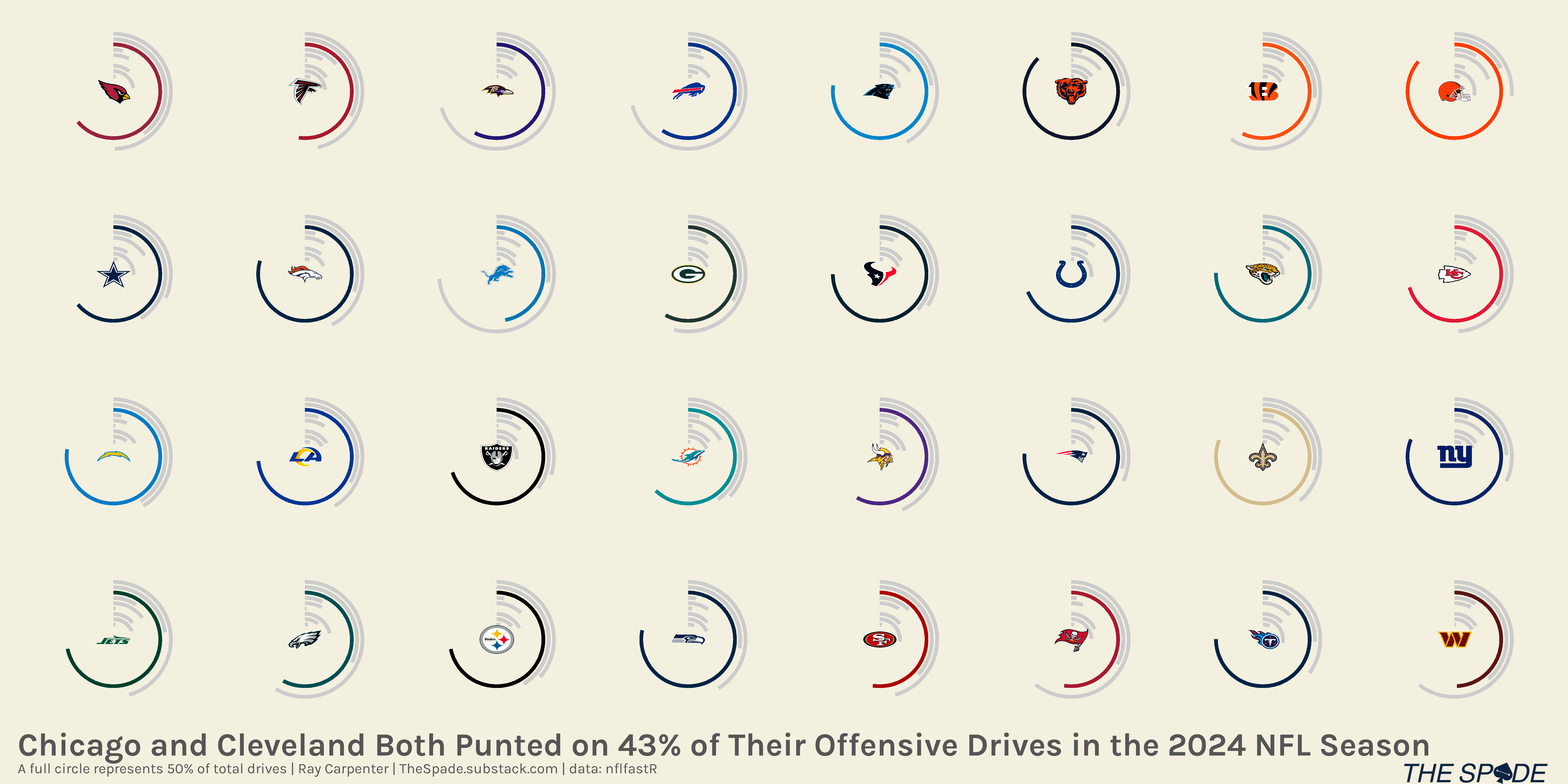
Sorry to pile on you, Browns and Bears fans. At least if you’re a Bears fan, your team hired the offensive coordinator from the team who topped our touchdown drive frequency ranking! If you’re a Browns fan…I have no words of encouragement for you.
One last chart, we’ll look at turnovers next.
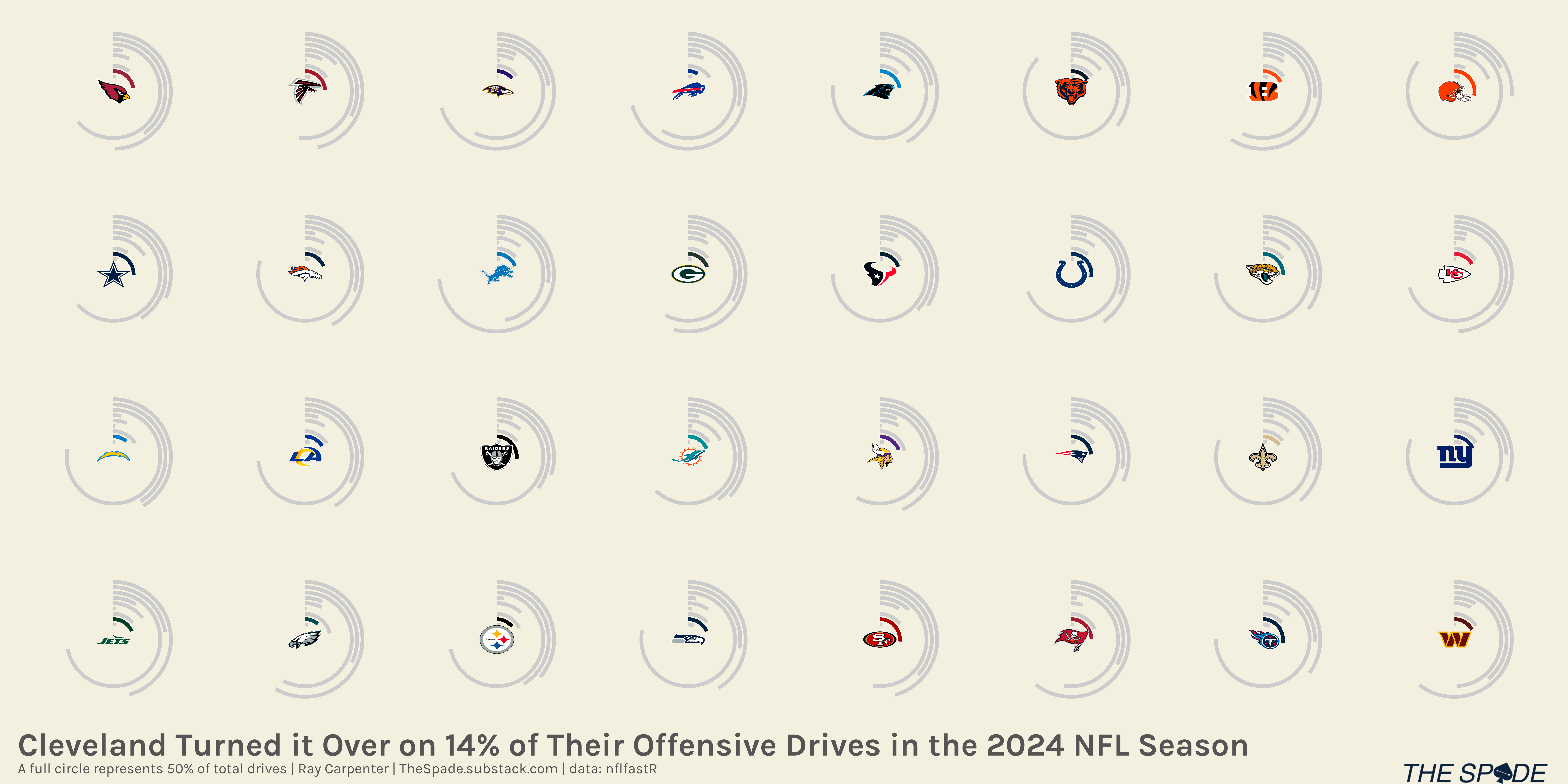
Ouch. So sorry, Browns fans.
I’ll be back tomorrow with a tutorial on how to make these graphs, thanks everyone.